A successful commercial project depends on hundreds of decisions made across design, engineering, procurement, and construction. While clients may focus first on the
finished space’s appearance, long-term performance begins with less visible elements such as foundations, reinforcing bars, utility routes, and structural connections.
Planning for civil and commercial projects must connect early construction requirements with later interior work. Decisions about structural materials can affect room layouts, ceiling heights, service access, and the placement of furniture or equipment. At the same time, the intended interior use may influence structural loads, floor construction, electrical demand, and ventilation requirements.
By treating the building structure and interior environment as parts of one coordinated project, teams can reduce conflicts, manage costs, and create a commercial space that performs as intended.
Establishing the Project Requirements
Planning should begin with a clear understanding of how the completed building will be used. An office, restaurant, retail store, warehouse, and medical facility will have different structural, mechanical, electrical, safety, and interior requirements.
The project brief should identify expected occupancy, daily activities, equipment, storage needs, accessibility requirements, and desired customer experience. It should also include the available budget, target completion date, sustainability goals, and possibilities for future expansion.
These details influence decisions throughout the project. A commercial kitchen may require heavy equipment, drainage, ventilation, and washable finishes. A retail space may need open floor areas, flexible displays, and strong lighting infrastructure. Establishing these needs early gives architects and engineers a reliable basis for design.
Coordinating the Structural System
Once the project requirements are clear, structural engineers can develop a system that can carry the expected loads. In reinforced concrete construction, this includes determining the dimensions of foundations, columns, beams, slabs, and walls.
Reinforcing bars are positioned within concrete to resist tensile forces, control cracking, and improve structural performance. Their size, grade, spacing, and arrangement must be based on engineering calculations and relevant construction standards.
Structural planning should also account for interior use. Heavy shelving, large water tanks, machinery, safes, or densely occupied areas may create loads that affect slab and foundation design. Identifying these features before construction helps prevent expensive strengthening work later.
Accurate rebar detailing is equally important. Congested reinforcement can interfere with concrete placement, while poorly coordinated openings may conflict with structural bars. Clear drawings and early collaboration among designers, engineers, fabricators, and contractors can reduce these problems.
Planning the Building Services
Commercial interiors rely on mechanical, electrical, plumbing, fire-protection, security, and communication systems. These services must be coordinated with the structure before pouring concrete or closing walls.
Plan openings for pipes, ducts, cables, and access panels carefully. Cutting through a finished structural element to create a new route may damage reinforcement or reduce the element’s capacity. The appropriate engineer must review any necessary modification.
Digital building models can help teams identify clashes among reinforcing bars, service lines, ceiling systems, and architectural features. Resolving conflicts during design is generally faster and less disruptive than making changes on the construction site.
Service planning should also consider maintenance. Valves, electrical panels, filters, and mechanical equipment need to be accessible. Hiding every component may improve appearance, but inaccessible systems can create problems when inspections or repairs are required.
Developing the Interior Layout
The interior layout translates the project brief into a functional space. Designers determine how people will enter, move through, work in, and exit the building. They also consider furniture placement, privacy, visibility, acoustics, storage, and accessibility.
Structural features can influence the layout. Columns may define circulation routes or divide work areas, while load-bearing walls can limit future changes. Instead of treating these features as obstacles, designers can incorporate them into partitions, counters, shelving, or architectural details.
The arrangement must also support emergency exits and fire-safety requirements. Corridors, doors, ramps, stairs, and accessible routes should remain clear and properly sized. Address these practical elements from the beginning rather than adding them after the visual concept is finalized.
Selecting Interior Finishes
Interior finishes shape how occupants and visitors experience a commercial space. Flooring, wall treatments, ceilings, fixtures, and decorative surfaces establish its color, texture, atmosphere, and brand identity.
Appearance is only one part of the selection process. Materials should also suit the traffic level and activities in each area. A hotel lobby may need flooring that resists wear while maintaining an elegant appearance. A clinic may prioritize easy-to-clean, low-porosity surfaces. A restaurant needs finishes that can tolerate moisture, spills, heat, and frequent cleaning.
Consider fire performance, slip resistance, indoor air quality, acoustics, and maintenance requirements. A cheaper finish may create higher long-term costs if it requires frequent repair or replacement. Samples and mock-ups can help teams evaluate color, texture, joints, lighting effects, and installation quality before approving materials for the entire project.
Connecting Procurement With the Schedule
Commercial projects can be delayed when essential materials arrive late or do not match the approved specifications. Procurement planning should begin early, especially for reinforcing steel, customized fixtures, imported finishes, lighting systems, and specialized equipment.
The project team should confirm product availability, manufacturing time, transportation requirements, storage conditions, and acceptable alternatives. Structural materials are needed early, while many decorative finishes are installed much later. However, some interior products may require early decisions because they affect electrical locations, wall supports, or floor levels.
Accurate quantity estimates can help prevent shortages and overbuying. Ordering too little may stop work, while ordering too much can increase costs and generate waste.
Maintaining Quality Throughout Construction
Quality control should continue from foundation work to final installation. Check reinforcing bars for correct size, spacing, cover, support, and connections before placing concrete. Inspect concrete quality, curing, and finished dimensions.
During interior construction, teams should verify alignments, surface preparation, fastening methods, sealants, joints, and product specifications. Protective measures may be needed to prevent ongoing work from damaging completed floors, walls, and fixtures.
Regular site meetings allow contractors, consultants, and clients to review progress and resolve issues quickly. Updated drawings and documented approvals also reduce confusion when changes occur.
Creating a Unified Commercial Space
A commercial project should not be divided into unrelated structural and decorative stages. The reinforcing bars inside the concrete, the service systems above the ceiling, and the visible interior finishes all contribute to the building’s performance.



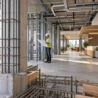 A successful commercial project depends on hundreds of decisions made across design, engineering, procurement, and construction. While clients may focus first on the
  Cleaning clothes based on their instructions, mending small tears and holes, and putting them in the right place will help them last longer in service. If an item is no longer required, one could give it to someone else or sell/exchange it for someone else.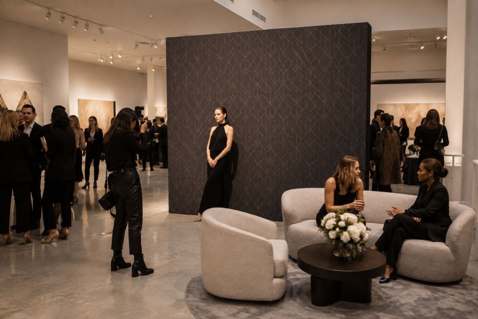

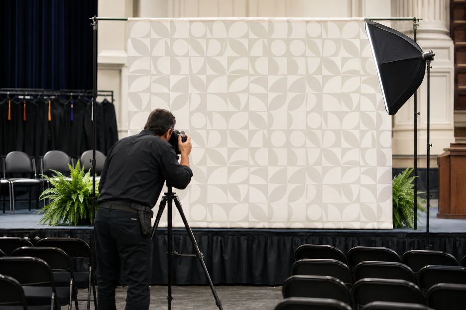







 Harmonious color, texture, and shape can assist in creating personal style in fashion and interior environments. Considerable design decisions lead to comfort and aesthetic unity.
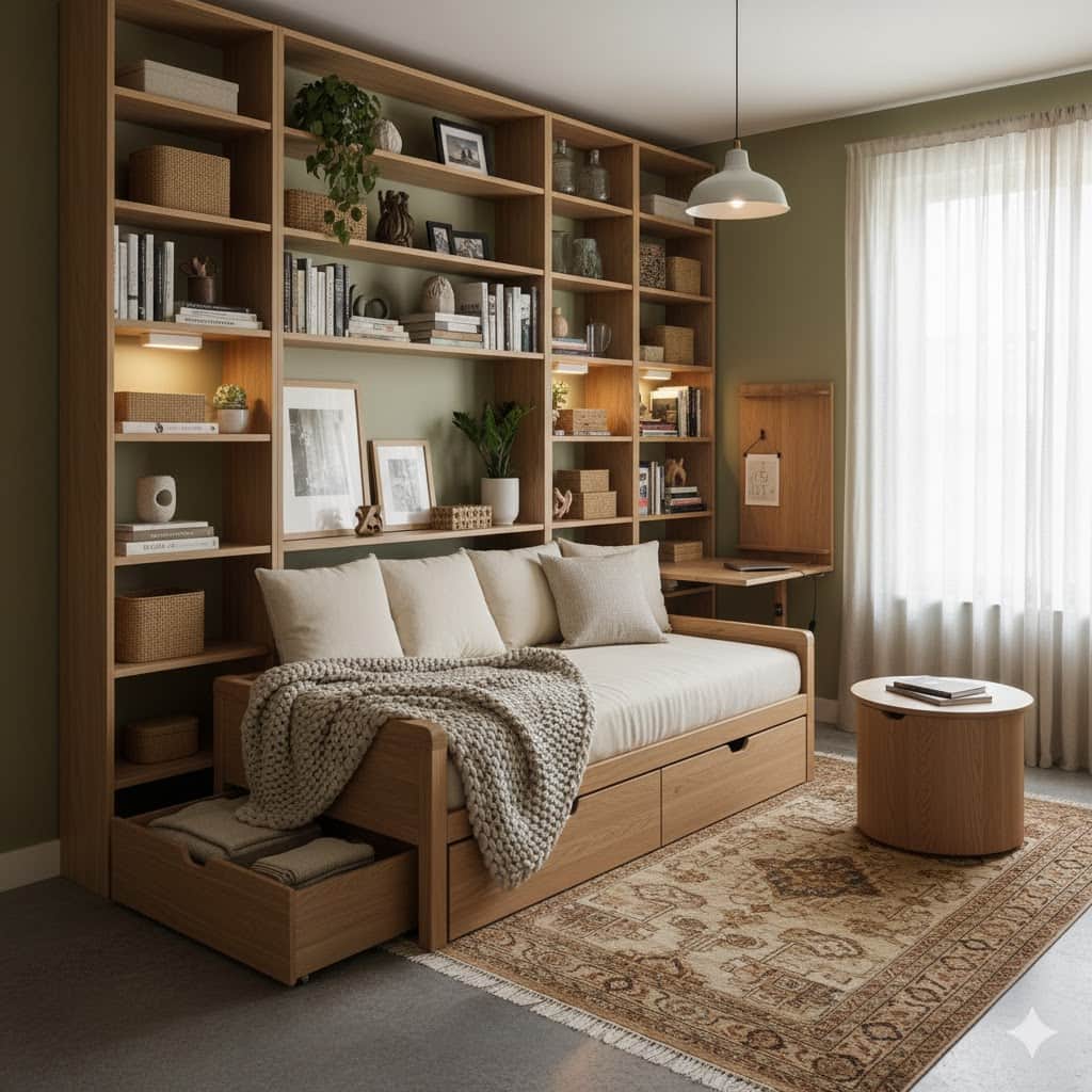
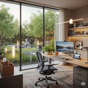 The key to a home office design is locating the place. Natural light increases energy and helps to restore the eyes. Put your office by a window. Even when the space is small, a small corner can be maximized using the magic of furniture and accessories.
 Be a maker! Use outdated frames to display vintage fashion or movie posters from your favorite era. A worn lampshade may become a standout item that compliments your favorite swing dress using paint and fabric scraps.
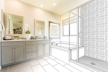 You can give your bathroom a makeover without breaking the bank. One way to lessen one’s influence on the environment is to build a sustainable area that is both aesthetically pleasing and environmentally friendly. To kick things off, here are some pointers:
 Recycled fixtures gives used materials a second chance, which cuts down on trash in landfills and the damage that making furniture does to the environment.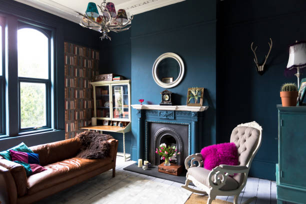


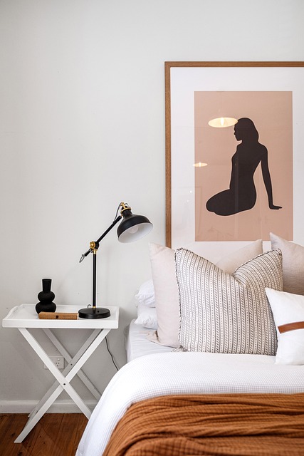



 Digital posters and signages are making headways as popular decorative kiosk displays especially now that online stores pose as tougher competition than before. The pandemic and inflation have changed consumer behaviors in a lot of ways, making it even more important for store owners to improve the way they run their offline outlets. Although most businesses now have online stores, maintaining at least a kiosk as physical outlet can help boost sales. A kiosk, as opposed to maintaining a shop or boutique is space-saving particularly for specialty boutiques.
 There is a growing demand for digital signages, but bear in mind that they are only as good as their beneficial uses to both customers and store personnel. The visuals may be bright and attractive but do they provide the images that most customers are looking for?




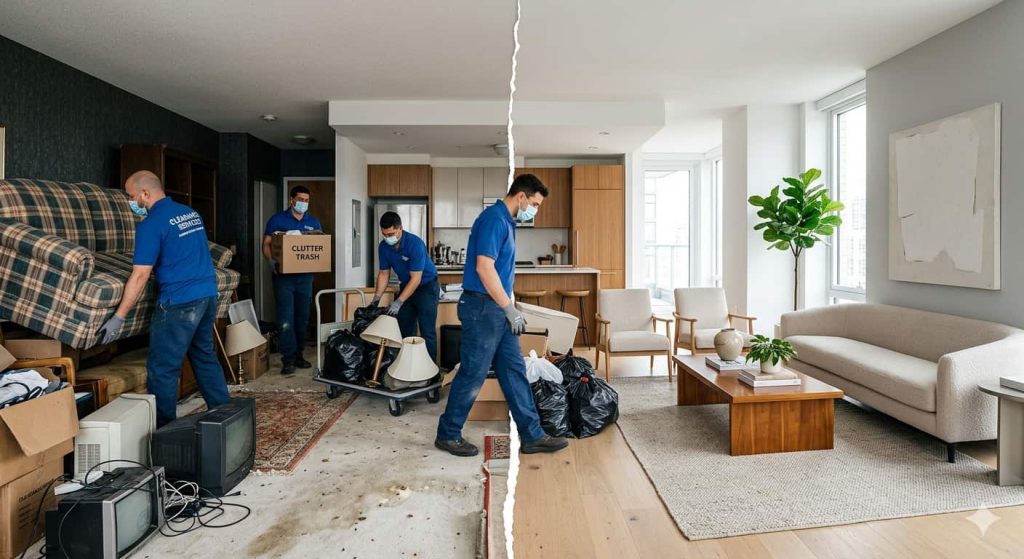
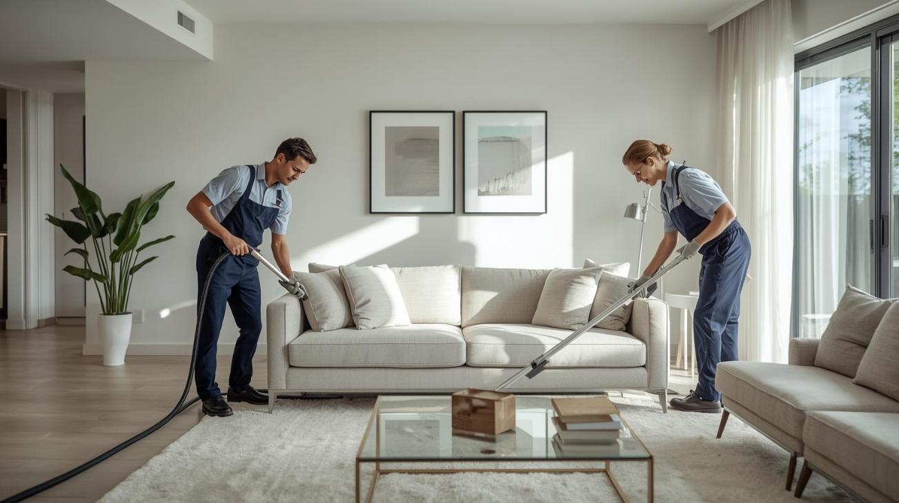
 Interior styling is often seen as a matter of furniture, color palettes, and decorative pieces. But before any of that can truly stand out, the space itself has to be clean, not just surface-level tidy, but deeply and professionally cleaned. Styling builds on a foundation, and many homeowners rely on experienced providers such as Al Masa Company to ensure that foundation is properly maintained. If the space is dusty, stained, or dull, even the most carefully chosen décor won’t have the impact it should. Professional cleaning does more than improve hygiene; it sharpens a space’s visual quality and supports every design decision that follows.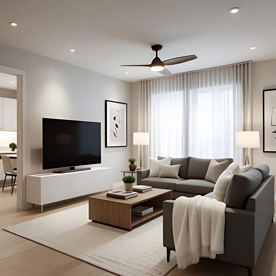
 Neon Noir offers bold fashion decisions, a visual feast of neon signs, reflected surfaces and gradient lighting. Interiors are dynamic and luminous, and so is the fashion-conscious spirit of its clientele.