
From Fashion to Interiors: Why Texture and Natural Tones Keep Crossing Design Boundaries
Fashion and interior design have long shared ideas about colour, material, proportion, and texture. Both disciplines work with surfaces that people see and touch, so similar visual ideas often appear in clothing and rooms at the same time. Recent research into interior materials also shows that texture, lightness, and tactile qualities can influence how people perceive a space.
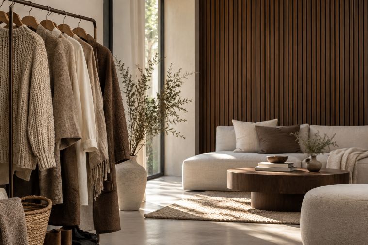
This crossover is easy to see in today’s interest in layered neutrals and natural-looking finishes. A knitted jacket can gain depth from its weave rather than a bold print. A room can work in much the same way. QuietWalls, an industry specialist in acoustic wall treatments, offers decorative options designed to combine visual texture with acoustic functions such as reducing reflected sound and echo. Products such as their acoustic wall panels provide a practical example, with slatted surfaces and finishes including light oak, walnut, white, and stone or concrete looks.
Why Does Texture Work Across Different Design Fields?
Texture gives a surface visual information without requiring strong colour. Fashion designers can layer wool, linen, leather, denim, or other fabrics within a narrow palette and still create contrast. Interior designers use similar principles with timber, stone, upholstery, rugs, plaster, and wall treatments.
The effect is partly about how materials are perceived. A 2026 study published in Buildings examined people’s responses to wood through visual, tactile, auditory, and combined sensory conditions. It found that vision had the strongest influence on perception, while touch also made a meaningful contribution. Lightness was particularly important in how participants judged surface qualities.
This helps explain why a neutral room does not necessarily need to feel plain. Grain, grooves, soft fabrics, matte surfaces, and changes in depth can create variation even when most of the palette stays within beige, brown, cream, grey, or white.
Neutral Does Not Have to Mean Flat
Neutral palettes regularly move between clothing and interiors because they make layering relatively simple. Rather than competing for attention, quieter colours allow differences in texture, shape, and material to become more visible.
Natural materials are especially relevant here. A recent review in Buildings identifies wood and stone as important materials within biophilic design research because their texture, colour, and form can provide indirect connections with nature. The review also found that wood was the most frequently studied natural material and has been associated with comfort, perceived naturalness, and satisfaction.
That does not mean every interior needs real timber or stone. Natural-looking finishes can serve a different purpose. They can introduce visual warmth, grain, or roughness while meeting practical requirements involving cost, installation, maintenance, or acoustic performance.
What Changes When Walls Become Part of the Layering?
Fashion layering usually starts with a base and builds outward. Interiors can follow a comparable logic, with walls providing the background while furniture, lighting, textiles, art, and smaller objects add further layers. This shared design language between fashion and interiors can help explain why similar ideas around texture, proportion, restrained colour, and material often appear in both fields.
A slatted wall changes that relationship because the background itself gains rhythm and depth. Vertical lines create subtle shadow, while the finish determines how strongly the surface contrasts with surrounding elements. Light oak can sit quietly beside pale fabrics. Walnut creates a darker visual anchor. White keeps the relief of the slats while reducing colour contrast. Concrete or stone effects can bring a cooler, more industrial character.
The comparison with clothing should not be taken too literally, but it is useful as a design principle. A textured coat can make a simple outfit more interesting without introducing several colours. Similarly, a dimensional wall treatment can add detail to a restrained room without relying on patterned wallpaper or bright paint.
Function Makes the Interior Comparison More Complicated
Here the connection between fashion and interiors begins to separate. A garment can be replaced when tastes change. Wall finishes generally involve more money, labour, and disruption, so practical performance carries greater weight.
Acoustic treatments illustrate this difference. Decorative slatted panels are intended to influence sound as well as appearance. QuietWalls, for example, describes its walnut panels as wall or ceiling treatments that can help soften echo and improve room acoustics. The company also distinguishes acoustic treatment from full soundproofing, an important difference when considering what these products can realistically achieve.
Research also suggests that material experience is more complicated than simply adding more wood. A study published by Emerald Publishing examined simulated office interiors with different amounts and placements of wood. Participants responded most positively to an image containing a moderate amount of timber, suggesting that placement and balance can matter alongside the material itself.
Where Can Trend-Led Design Fall Short?
The risk comes when a fashionable material is chosen without considering the room around it. A finish that looks warm in a bright showroom may appear much darker in a north-facing room. Strong vertical slats can make an architectural statement on a large wall but may feel busy when several other surfaces already contain prominent patterns.
Scale matters too. Ceiling height, wall width, windows, doors, flooring, and furniture all affect how a treatment is perceived. Lighting can change the apparent colour of timber and increase or soften shadows between slats. These factors are harder to change than cushions, jackets, or seasonal accessories.
There is also reason to avoid sweeping claims about natural materials. A randomized controlled trial published in the Journal of Environmental Psychology found positive effects on emotional well-being in a wooden office, but some physiological findings did not follow the researchers’ expectations. The authors presented the work as evidence that can inform larger future studies rather than a final answer about wood and well-being.
Design Ideas Travel, but Rooms Still Need Their Own Logic
Fashion and interiors will probably continue borrowing from each other because both respond to changing ideas about colour, comfort, texture, and identity. The current interest in layered neutrals and natural-looking surfaces makes that relationship particularly visible.
Still, a home is not a seasonal outfit. Texture works best when it supports the architecture and the way a room is used. Slatted walls, timber tones, stone effects, textiles, and other tactile elements can bring depth to restrained schemes, but their value depends on proportion, light, function, and durability.
The strongest lesson from the fashion-interior crossover may therefore be less about following a particular look and more about learning how to layer. Colour can stay quiet while surfaces do more of the visual work. Trends can provide inspiration, but the room itself should have the final say.