
Designing Branded Photo Areas That Complement Fashion Event Interiors
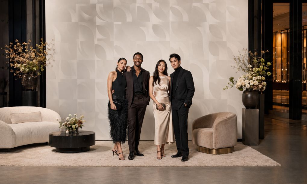
Fashion events are designed to be photographed, yet a branded backdrop can disrupt its surroundings. Oversized marks, hard reflections, or clashing colors may pull attention away from clothing, guests, and architecture. The problem is often a failure to plan the photo area as part of the interior.
The solution begins before production. When organizers consider step and repeat printing NYC during event planning, they can coordinate the backdrop with the venue, lighting, camera position, and guest flow. That coordination connects brand visibility with a composed fashion setting.
Step 1: Study the Interior Before Designing the Backdrop
Begin with photographs, measurements, finish samples, and a lighting plan. Note the floor color, wall texture, ceiling height, furniture, and entrance sightlines. A restrained design file may still produce an imposing wall in a narrow room.
Measure the space for people, photographers, lights, and queues. Choose a position that avoids doors, circulation routes, and important architecture. The area should feel planned, rather than placed in the nearest empty corner.
Step 2: Choose a Finish That Behaves Well Under Light
Material finish affects both the room and the photograph. Glossy surfaces can produce bright reflections when flash or directional fixtures strike them, while matte materials generally create a quieter visual field. The linked guide from Edible Manhattan similarly advises checking how backdrop material performs under event flash, rather than judging it only in ambient light.
Photograph physical samples under the planned lighting. Fabric can add softness, but it needs even tension. Rigid panels create crisp edges, although seams and glare need attention. Consider appearance, installation, reuse, and photographic behavior.
Step 3: Build a Controlled Color Palette
Use the event palette as the starting point. The backdrop need not match every chair, flower, or runway element. Choose one dominant neutral or low-intensity color, then add brand colors in measured amounts.
Color should also be proofed under controlled conditions. Adobe explains that surrounding light level and color temperature influence how printed color is perceived. Request a printed proof, view it under lighting close to the event conditions, and compare it with fabric, paint, and décor samples before approving production.
Step 4: Plan Lighting for Faces, Fashion, and Finish
A good photo area lights people evenly while keeping the background legible. Mixed color temperatures can complicate accurate skin tones and garment colors. Canon Europe notes that daylight, tungsten, fluorescent light, and flash have different characteristics requiring suitable white-balance decisions.
Use soft, angled light, then test with likely cameras and phones. A broader look at how lighting shapes fashion and interiors can help planners consider its effect on clothing, décor, color, and atmosphere. Check for shadows, glare, uneven illumination, and color shifts. Decorative lighting may support the mood, but it should not cast strong colors across faces or garments.
Step 5: Set Pattern Spacing and Scale at Camera Distance
Repeating marks need space to remain recognizable without competing with the subject. Test a full-size section behind one person, a pair, and a group. Review full-length and waist-up compositions.
Contrast matters as much as spacing. Guidance from the World Wide Web Consortium concerns digital readability, but its central principle is useful here: light-dark contrast supports recognition more reliably than hue alone. Use that idea as a design check, then confirm the actual result through printed camera tests.
Step 6: Use Décor to Integrate, Not Conceal
Décor should frame the branded wall and connect it to the venue. A restrained rug, low floral arrangement, bench, or sculptural lights can echo materials used elsewhere. Keep tall objects away from the standing area, where they may cover the pattern or create awkward shapes.
Leave breathing room around the backdrop. Fashion interiors often depend on proportion, negative space, and carefully edited details. Extending every decorative element into the photo zone can make images look busy. One or two repeated interior cues are usually enough to establish continuity.
Step 7: Run a Full Visual Rehearsal
Complete a mock-up before guests arrive. Place people of different heights in the marked standing zone and photograph them from the expected camera position. Review wide shots, portraits, and phone crops. A rehearsal allows the team to adjust lights, floor marks, décor, and camera distance while changes are still manageable.
Final Cohesion Checklist
- Confirm dimensions, circulation space, camera distance, and clear sightlines.
- Test the selected finish with ambient light and flash.
- Compare a printed color proof with venue and décor samples.
- Check logo scale and spacing behind individuals and groups.
- Use soft, consistent light that respects skin tones and garment colors.
- Keep props low, restrained, and related to the wider interior.
- Review full-length, portrait, and phone-format test photographs.
A cohesive photo area does not need to hide its purpose. It should communicate the event identity while preserving the hierarchy of the room. When material, palette, light, pattern, scale, and décor are planned together, branding becomes one considered layer of the fashion interior rather than its dominant subject.