
Tag Archives

2 Articles

Designing Branded Photo Areas That Complement Fashion Event Interiors
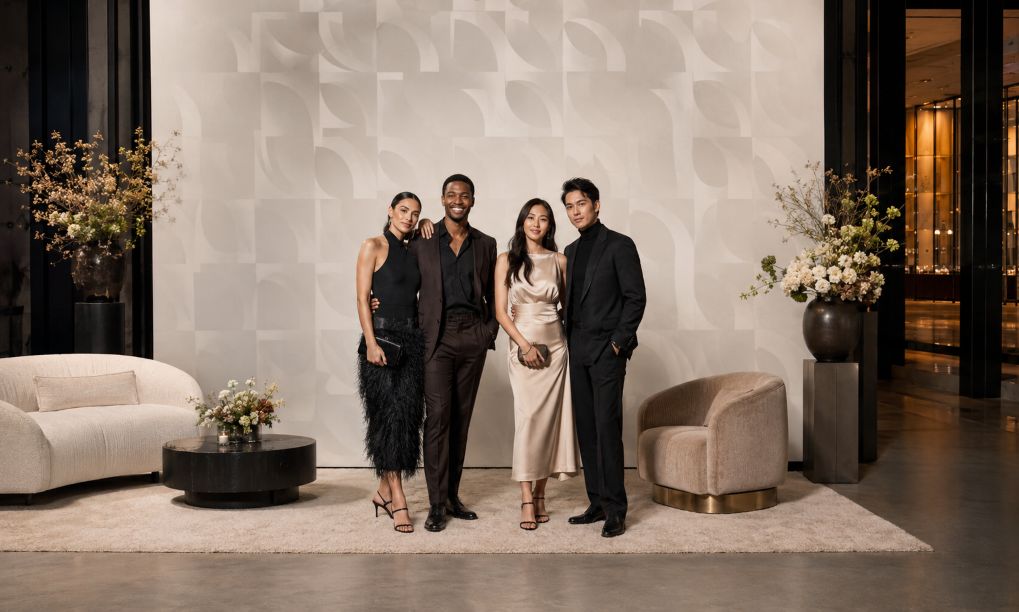
Elegant geometric fashion photo lounge

Fashion events are designed to be photographed, yet a branded backdrop can disrupt its surroundings. Oversized marks, hard reflections, or clashing colors may pull attention away from clothing, guests, and architecture. The problem is often a failure to plan the photo area as part of the interior.

The solution begins before production. When organizers consider step and repeat printing NYC during event planning, they can coordinate the backdrop with the venue, lighting, camera position, and guest flow. That coordination connects brand visibility with a composed fashion setting.

Step 1: Study the Interior Before Designing the Backdrop

Begin with photographs, measurements, finish samples, and a lighting plan. Note the floor color, wall texture, ceiling height, furniture, and entrance sightlines. A restrained design file may still produce an imposing wall in a narrow room.

Measure the space for people, photographers, lights, and queues. Choose a position that avoids doors, circulation routes, and important architecture. The area should feel planned, rather than placed in the nearest empty corner.

Step 2: Choose a Finish That Behaves Well Under Light

Material finish affects both the room and the photograph. Glossy surfaces can produce bright reflections when flash or directional fixtures strike them, while matte materials generally create a quieter visual field. The linked guide from Edible Manhattan similarly advises checking how backdrop material performs under event flash, rather than judging it only in ambient light.

Photograph physical samples under the planned lighting. Fabric can add softness, but it needs even tension. Rigid panels create crisp edges, although seams and glare need attention. Consider appearance, installation, reuse, and photographic behavior.

Step 3: Build a Controlled Color Palette

Use the event palette as the starting point. The backdrop need not match every chair, flower, or runway element. Choose one dominant neutral or low-intensity color, then add brand colors in measured amounts.

Color should also be proofed under controlled conditions. Adobe explains that surrounding light level and color temperature influence how printed color is perceived. Request a printed proof, view it under lighting close to the event conditions, and compare it with fabric, paint, and décor samples before approving production.

Step 4: Plan Lighting for Faces, Fashion, and Finish

A good photo area lights people evenly while keeping the background legible. Mixed color temperatures can complicate accurate skin tones and garment colors. Canon Europe notes that daylight, tungsten, fluorescent light, and flash have different characteristics requiring suitable white-balance decisions.

Use soft, angled light, then test with likely cameras and phones. A broader look at how lighting shapes fashion and interiors can help planners consider its effect on clothing, décor, color, and atmosphere. Check for shadows, glare, uneven illumination, and color shifts. Decorative lighting may support the mood, but it should not cast strong colors across faces or garments.

Step 5: Set Pattern Spacing and Scale at Camera Distance

Repeating marks need space to remain recognizable without competing with the subject. Test a full-size section behind one person, a pair, and a group. Review full-length and waist-up compositions.

Contrast matters as much as spacing. Guidance from the World Wide Web Consortium concerns digital readability, but its central principle is useful here: light-dark contrast supports recognition more reliably than hue alone. Use that idea as a design check, then confirm the actual result through printed camera tests.

Step 6: Use Décor to Integrate, Not Conceal

Décor should frame the branded wall and connect it to the venue. A restrained rug, low floral arrangement, bench, or sculptural lights can echo materials used elsewhere. Keep tall objects away from the standing area, where they may cover the pattern or create awkward shapes.

Leave breathing room around the backdrop. Fashion interiors often depend on proportion, negative space, and carefully edited details. Extending every decorative element into the photo zone can make images look busy. One or two repeated interior cues are usually enough to establish continuity.

Step 7: Run a Full Visual Rehearsal

Complete a mock-up before guests arrive. Place people of different heights in the marked standing zone and photograph them from the expected camera position. Review wide shots, portraits, and phone crops. A rehearsal allows the team to adjust lights, floor marks, décor, and camera distance while changes are still manageable.

Final Cohesion Checklist

  • Confirm dimensions, circulation space, camera distance, and clear sightlines.
  • Test the selected finish with ambient light and flash.
  • Compare a printed color proof with venue and décor samples.
  • Check logo scale and spacing behind individuals and groups.
  • Use soft, consistent light that respects skin tones and garment colors.
  • Keep props low, restrained, and related to the wider interior.
  • Review full-length, portrait, and phone-format test photographs.

A cohesive photo area does not need to hide its purpose. It should communicate the event identity while preserving the hierarchy of the room. When material, palette, light, pattern, scale, and décor are planned together, branding becomes one considered layer of the fashion interior rather than its dominant subject.
What Makes a Backdrop Actually Work in Event Photos

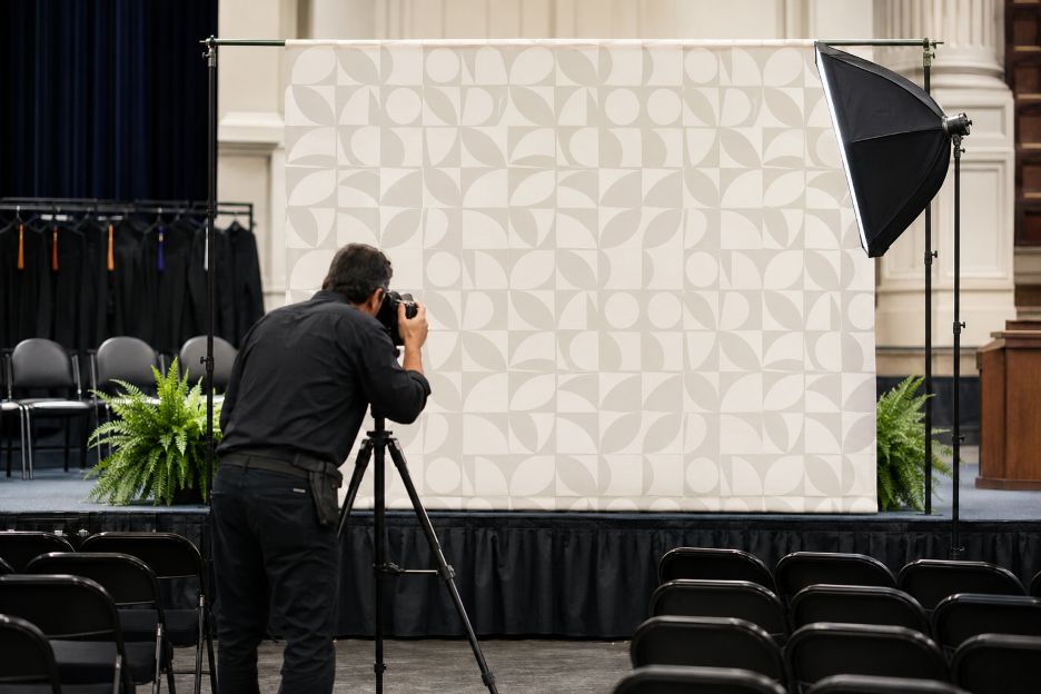
Photographer Tests Geometric Commencement Backdrop

Backdrop design has a measurable effect on whether event photographs appear clear, balanced, and useful across different media. From campus commencements to public gatherings, the background influences exposure, subject separation, logo visibility, and the amount of cropping an image can tolerate. Guidance from Adobe stresses that effective visual identities must remain recognizable at different sizes and placements, a principle that applies directly to event photo walls.

Organizers considering a step and repeat NYC setup should therefore evaluate the design through a camera lens rather than treating it as room decoration. A pattern that looks polished in a digital proof may behave differently behind several people, under mixed lighting, or inside a tightly cropped social media post.

1. Logo Spacing Determines What the Camera Captures

Repeated marks should be spaced closely enough that several remain visible around a person’s head and shoulders. When the gaps are too wide, a portrait may show only fragments. Overly tight repetition creates the opposite problem, making the background look crowded.

Adobe recommends giving identity marks clear space so surrounding elements do not weaken their visibility. For a photo backdrop, that space must be balanced against the expected framing. Testing the artwork with a simulated head-and-shoulders crop helps organizers judge whether each photograph will contain complete, readable marks.

2. Scale Must Match the Planned Photographs

Logo size should reflect how photographers will frame guests. Large marks may work in full-body group photographs but disappear partially behind subjects in close portraits. Very small marks can look sharp on the printed surface yet become difficult to identify after an image is reduced.

Guidance from Adobe identifies versatility across sizes and layouts as a feature of successful logo design. Event teams can apply that idea by producing sample crops for individual portraits, couples, and groups. The goal is a pattern that remains recognizable without competing with faces.

3. Contrast Matters Under Real Event Lighting

Contrast affects how easily cameras distinguish artwork from its background. The World Wide Web Consortium uses a contrast ratio of at least 4.5:1 for normal text and 3:1 for large text in its accessibility guidance. Those figures were developed for digital content, but they provide a useful reference when assessing whether words and graphic elements are visually distinct.

Lighting can change that distinction. Warm ballroom lights may shift white fabric toward yellow, while colored stage lights can alter brand colors. A flash can brighten reflective areas and reduce detail. Photographing a printed sample under the venue’s actual lighting is more reliable than judging colors solely on a computer monitor.

4. Matte Surfaces Usually Photograph More Consistently

Surface finish influences reflections. Canon explains in its photography guidance that direct light can produce glare on reflective subjects, while changing the light’s angle or diffusing it can reduce harsh reflections. A glossy background may therefore develop bright spots when hit by flash, video lights, or nearby spotlights.

Matte materials generally scatter light more evenly, although material choice also depends on durability, transport, and installation needs. A test photograph should be taken from several positions because glare that is invisible from the center may appear when the camera moves toward either side.

5. Color Choices Should Support the People in Front

The strongest background color is not always the most dramatic one. Light clothing can blend into a pale wall, while dark suits may lose definition against deep colors. Highly saturated patterns can also draw attention away from faces.

Adobe notes that colors form part of a broader visual identity and should suit the intended audience. For commencements, conferences, award ceremonies, and community events, organizers can review likely clothing colors before approving the artwork. Neutral fields with controlled contrast often accommodate a wider range of guests.

6. Social Media Cropping Changes What Survives

Event images rarely remain in their original dimensions. They may be converted into square posts, vertical stories, website thumbnails, or livestream graphics. Adobe advises designers to consider whether a logo remains versatile at different sizes, layouts, and placements. This matters when the outer edges of a photograph are removed.

Important marks should appear throughout the central area rather than depending on a border or corner. Fine lettering, thin lines, and detailed seals may also lose clarity when a photograph is compressed. Reviewing the design at thumbnail size reveals problems that are easy to miss on a full-resolution screen.

7. Physical Setup Is Part of the Design

Even carefully prepared artwork will photograph poorly if the structure sags, wrinkles, or leans. The Professional Photographers of America emphasizes controlling backgrounds and removing distractions when composing portraits. Visible frame edges, floor gaps, cables, and creases all become competing elements within the image.

The backdrop should be wide enough for the expected group size and tall enough to remain behind taller guests. Organizers planning several events may also consider reusable backdrop materials that can be transported, maintained, and installed repeatedly without compromising photo quality. Floor markings can guide people toward the most useful position, while a short camera test can confirm that stands and surrounding equipment stay outside the frame.

A Practical Standard for Any Organizer

These considerations apply well beyond universities. Festival planners, nonprofit groups, conference teams, cultural organizations, and public agencies face the same basic photographic questions. Clear spacing, suitable scale, controlled contrast, low glare, and crop-resistant artwork help create images that remain usable after the event.

A successful repeating photo wall does not need to dominate the setting. It needs to perform consistently for photographers, guests, and viewers on smaller screens. Early testing with realistic lighting and framing gives organizers the clearest indication of whether the final installation will work.

𐌢