
Tag Archives

3 Articles

Designing Branded Photo Areas That Complement Fashion Event Interiors

Elegant geometric fashion photo lounge

Fashion events are designed to be photographed, yet a branded backdrop can disrupt its surroundings. Oversized marks, hard reflections, or clashing colors may pull attention away from clothing, guests, and architecture. The problem is often a failure to plan the photo area as part of the interior.

The solution begins before production. When organizers consider step and repeat printing NYC during event planning, they can coordinate the backdrop with the venue, lighting, camera position, and guest flow. That coordination connects brand visibility with a composed fashion setting.

Step 1: Study the Interior Before Designing the Backdrop

Begin with photographs, measurements, finish samples, and a lighting plan. Note the floor color, wall texture, ceiling height, furniture, and entrance sightlines. A restrained design file may still produce an imposing wall in a narrow room.

Measure the space for people, photographers, lights, and queues. Choose a position that avoids doors, circulation routes, and important architecture. The area should feel planned, rather than placed in the nearest empty corner.

Step 2: Choose a Finish That Behaves Well Under Light

Material finish affects both the room and the photograph. Glossy surfaces can produce bright reflections when flash or directional fixtures strike them, while matte materials generally create a quieter visual field. The linked guide from Edible Manhattan similarly advises checking how backdrop material performs under event flash, rather than judging it only in ambient light.

Photograph physical samples under the planned lighting. Fabric can add softness, but it needs even tension. Rigid panels create crisp edges, although seams and glare need attention. Consider appearance, installation, reuse, and photographic behavior.

Step 3: Build a Controlled Color Palette

Use the event palette as the starting point. The backdrop need not match every chair, flower, or runway element. Choose one dominant neutral or low-intensity color, then add brand colors in measured amounts.

Color should also be proofed under controlled conditions. Adobe explains that surrounding light level and color temperature influence how printed color is perceived. Request a printed proof, view it under lighting close to the event conditions, and compare it with fabric, paint, and décor samples before approving production.

Step 4: Plan Lighting for Faces, Fashion, and Finish

A good photo area lights people evenly while keeping the background legible. Mixed color temperatures can complicate accurate skin tones and garment colors. Canon Europe notes that daylight, tungsten, fluorescent light, and flash have different characteristics requiring suitable white-balance decisions.

Use soft, angled light, then test with likely cameras and phones. A broader look at how lighting shapes fashion and interiors can help planners consider its effect on clothing, décor, color, and atmosphere. Check for shadows, glare, uneven illumination, and color shifts. Decorative lighting may support the mood, but it should not cast strong colors across faces or garments.

Step 5: Set Pattern Spacing and Scale at Camera Distance

Repeating marks need space to remain recognizable without competing with the subject. Test a full-size section behind one person, a pair, and a group. Review full-length and waist-up compositions.

Contrast matters as much as spacing. Guidance from the World Wide Web Consortium concerns digital readability, but its central principle is useful here: light-dark contrast supports recognition more reliably than hue alone. Use that idea as a design check, then confirm the actual result through printed camera tests.

Step 6: Use Décor to Integrate, Not Conceal

Décor should frame the branded wall and connect it to the venue. A restrained rug, low floral arrangement, bench, or sculptural lights can echo materials used elsewhere. Keep tall objects away from the standing area, where they may cover the pattern or create awkward shapes.

Leave breathing room around the backdrop. Fashion interiors often depend on proportion, negative space, and carefully edited details. Extending every decorative element into the photo zone can make images look busy. One or two repeated interior cues are usually enough to establish continuity.

Step 7: Run a Full Visual Rehearsal

Complete a mock-up before guests arrive. Place people of different heights in the marked standing zone and photograph them from the expected camera position. Review wide shots, portraits, and phone crops. A rehearsal allows the team to adjust lights, floor marks, décor, and camera distance while changes are still manageable.

Final Cohesion Checklist

  • Confirm dimensions, circulation space, camera distance, and clear sightlines.
  • Test the selected finish with ambient light and flash.
  • Compare a printed color proof with venue and décor samples.
  • Check logo scale and spacing behind individuals and groups.
  • Use soft, consistent light that respects skin tones and garment colors.
  • Keep props low, restrained, and related to the wider interior.
  • Review full-length, portrait, and phone-format test photographs.

A cohesive photo area does not need to hide its purpose. It should communicate the event identity while preserving the hierarchy of the room. When material, palette, light, pattern, scale, and décor are planned together, branding becomes one considered layer of the fashion interior rather than its dominant subject.

Minimalist Living: Coordinating Contemporary Fashion Aesthetics with Modern Home Design

Stylish homeowner in a serene open-plan interior

Minimalism became a major artistic movement in the United States during the 1960s, using simplified geometric forms and industrial materials. The Museum of Modern Art explains that minimalist artists questioned traditional craftsmanship and treated space, structure, and materials as essential parts of the work. These principles later influenced fashion, architecture, furniture, and everyday styling.

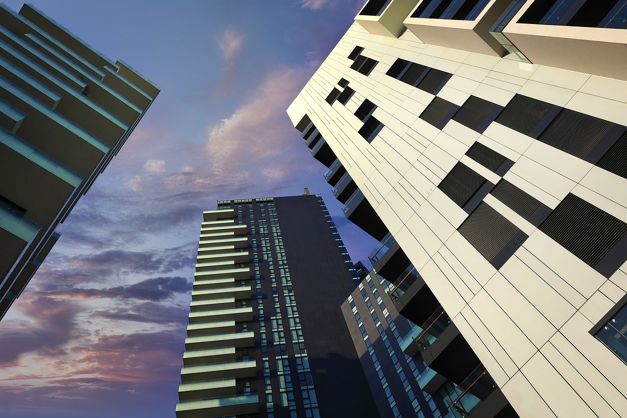
For people creating a contemporary home, the challenge is making personal style and interior design feel connected without turning every room into a literal copy of a wardrobe. One useful approach is to see the full range of contemporary architectural features, observing how transparent panels, restrained frames, and simple structural lines can provide cohesive inspiration.

The Problem: Minimalism Can Feel Disconnected

Minimalist clothing and minimalist interiors share a visual language, yet they serve different purposes. Clothing must support movement, comfort, climate, and personal expression. A home must accommodate storage, lighting, circulation, safety, and the needs of everyone using it. Applying the same rules without considering these differences can make an interior feel staged or a wardrobe unnecessarily restrictive.

Fashion minimalism usually relies on clean silhouettes, limited decoration, practical construction, and pieces that combine easily. The Victoria and Albert Museum identifies comfort, simplicity, and wearability as guiding ideas within Gabrielle Chanel’s work. These qualities remain relevant because they place function alongside appearance rather than treating simplicity as a purely visual choice.

Interior minimalism uses comparable ideas on a larger scale. Straight lines, open surfaces, controlled colour, and carefully selected objects help establish order. However, removing too much can produce rooms that lack warmth or fail to support daily routines. The objective is therefore considered selection, not emptiness.

Comparing the Two Aesthetics

A minimalist wardrobe often begins with a dependable base: tailored trousers, plain shirts, structured outerwear, and uncomplicated footwear. Colour may be restrained, but it does not have to be limited to white, black, or beige. Deep green, navy, terracotta, and muted blue can work when they are repeated thoughtfully.

The same principle applies at home. Walls and large furnishings establish the base, while artwork, textiles, plants, and smaller objects supply character. A person who prefers charcoal tailoring and silver accessories might consider grey upholstery, pale walls, and brushed metal details. Someone drawn to natural linen and brown leather may feel more comfortable with timber, woven fabrics, and warm stone.

Material honesty provides another connection. Minimalist fashion often allows the cut and texture of cloth to carry the design. Minimalist interiors similarly give visual importance to wood grain, glass, concrete, stone, and metal. The Museum of Modern Art notes that minimalist artists embraced materials such as aluminium, fibreglass, and commercial paint, demonstrating how ordinary substances can become expressive when form and placement are carefully controlled.

The Solution: Build a Shared Design Vocabulary

A practical solution is to identify three recurring qualities in a preferred wardrobe. These might be soft texture, precise structure, and muted colour. Exploring personal touches inspired by fashion can also show how individual style translates naturally into a living space. Soft texture could appear in curtains or rugs, structure in shelving and architectural lines, and muted colour across walls and upholstery.

Proportion also matters. Loose, layered clothing tends to communicate ease, while sharply tailored clothing suggests definition. Similar effects can be created through furniture. Rounded sofas and flowing curtains feel relaxed, while slim tables, angular seating, and linear lighting appear more precise. Mixing both approaches often creates a more comfortable result than following either one exclusively.

Transparency can introduce structure without adding visual weight. Glass partitions, open shelving, and glazed barriers define areas while allowing light and sightlines to continue. They work especially well when paired with repeated finishes, such as black metal, pale oak, or satin stainless steel. Consistency across a few details gives separate spaces a recognizable relationship.

Make Function Part of the Style

Useful design should guide decisions about materials as well as appearance. Reports from the United States Environmental Protection Agency explain that paints, finishes, adhesives, and furnishings can release volatile organic compounds indoors. Checking product information, selecting suitable low-emission options, and providing ventilation are sensible considerations when updating a room.

Storage deserves equal attention because visual calm is difficult to maintain when possessions have no designated place. Closed cabinets can contain irregular items, while open shelves are better reserved for objects worth displaying. Wardrobes benefit from the same logic: accessible storage for frequently worn pieces and separate space for seasonal or occasional clothing.

The Bridge to a Cohesive Home

Begin with one room and one frequently worn outfit. Compare their colours, materials, shapes, and overall mood. Select two or three connections worth developing, then test them through reversible changes such as cushions, lamps, artwork, or hardware. This measured process reduces the risk of creating an overly coordinated scheme.

Architectural elements can then provide the lasting framework. Flooring, doors, stair details, partitions, and barriers influence how a home feels across multiple rooms. When their lines and finishes relate to the owner’s broader aesthetic, furniture and accessories become easier to choose. The result feels intentional without depending on passing fashion trends.

A Personal Form of Minimalism

Minimalist living works best when it reflects real habits rather than a fixed catalogue image. Fashion and interior design can support one another through shared colour, proportion, texture, and function, but they do not need to match perfectly. Looking ahead, homes that balance restraint with comfort are likely to remain adaptable as wardrobes, families, and routines change. Cohesion comes from thoughtful repetition, while individuality comes from knowing where to depart from it.

Dressed for the Screen: 7 Ways Streaming Aesthetics Influence Fashion and Interior Spaces
streaming and interior design

Streaming has changed how people see the world, and now it is shaping how we dress and design our homes. The colors, textures, and styles we see on our screens often find their way into our closets and living rooms. Inspired by the digital mirror world of movie streaming alternatives like 123movies, today’s trends in fashion and interiors draw heavily from the visual storytelling that defines modern entertainment culture.

1. Minimalist Scenes Spark a New Calm

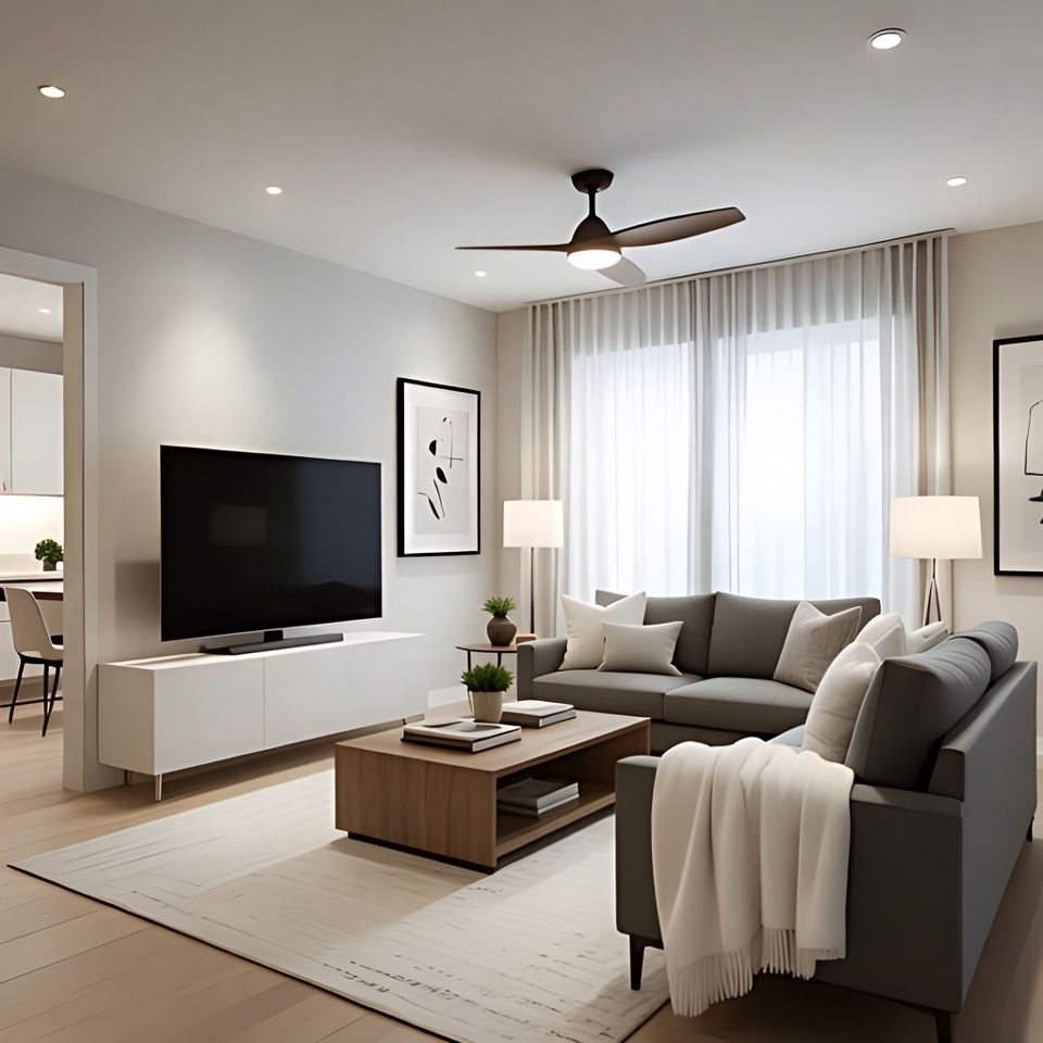
Popular shows often use minimalist set designs to express clarity and emotion. This has inspired a wave of simplicity in both clothing and interiors. Clean lines, muted tones, and open spaces dominate today’s aesthetic. Designers use soft textures, neutral palettes, and natural light to create calm, cinematic atmospheres that echo the on-screen serenity audiences crave.

2. Color Palettes That Tell a Story

Color has become a silent storyteller in modern cinema and streaming visuals. Deep blues often represent mystery, warm golds express nostalgia, and bright reds bring intensity. These same tones are showing up in wardrobes and living rooms alike. People are embracing cinematic color palettes to build moods within their own spaces, creating emotional resonance inspired by their favorite series or films.

3. The Return of Vintage Glamour

Costume dramas have revived a love for historical fashion and décor. Lace, velvet, and ornate embroidery are finding their way back into daily style. Similarly, interior designers are drawing inspiration from grand sets filled with vintage charm. Antique pieces, floral prints, and romantic lighting are blending with modern functionality, giving homes a timeless yet contemporary appeal.

4. The Rise of the Statement Piece

Streaming culture has inspired audiences to embrace bold, camera-ready details. Whether it is a bright velvet couch or a sharply tailored coat, these statement pieces command attention. They serve as focal points, adding character and confidence to both rooms and outfits. Just like a leading actor’s wardrobe, these pieces help express personality and mood instantly.

5. Dressing Like a Character

Audiences often mimic the looks of their favorite on-screen personalities. The cozy layers from a romantic series or the sharp suits of a crime thriller become blueprints for real-world fashion. Interior trends follow a similar path. A character’s apartment style, be it bohemian, futuristic, or minimalist, often becomes a reference point for fans looking to refresh their homes. The connection between fashion, set design, and self-expression has never been stronger.

6. The Digital Mirror Effect

Streaming has created a feedback loop where audiences and creators inspire each other. Viewers absorb design cues from their screens, and producers often craft scenes that reflect current social trends. This cycle blurs the boundary between digital fantasy and real-world living. As more people discover new movie streaming alternatives, the visual language of these platforms continues to shape creative direction in both fashion and interior design.

7. Lighting and Composition Go Mainstream

Good lighting used to be a film secret, but now it is a home essential. People are designing spaces with cinematic lighting, soft LED glows, and reflective surfaces that look stunning on camera. Even daily outfits are chosen with lighting in mind, especially in a selfie-driven culture. This awareness of visual composition reflects a growing desire to live within one’s own movie scene, every day.

For more ways to transform on-screen inspiration into real-world spaces, check out this guide on turning IPTV and streaming ideas into stunning interior designs for creative insights.

Blurring the Lines Between Reality and Screen

Streaming has turned visual storytelling into lifestyle inspiration. From wardrobe choices to interior makeovers, people are living out their favorite aesthetics. The sets, costumes, and colors we once admired on screen now shape how we express ourselves at home. As more viewers explore creative spaces through movie streaming alternatives, the connection between entertainment, fashion, and design continues to deepen. Our screens do more than entertain; they mirror the evolving story of how we live, dress, and dream.

𐌢