How To Design A Fashion Event Backdrop That Complement the Interior
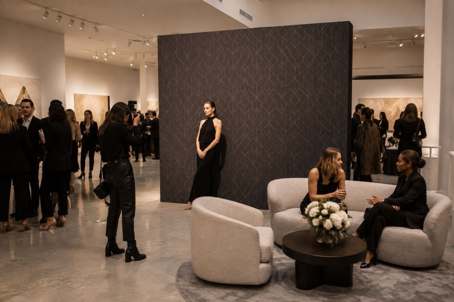
Fashion events depend heavily on visual presentation, and the venue itself often becomes part of the brand experience. A carefully designed showroom, gallery, hotel, or loft may already feature distinctive flooring, lighting, furniture, and architectural details. Adding a branded photo backdrop without considering those elements can create visual competition rather than a cohesive setting.
The solution begins with treating the backdrop as part of the interior instead of as a separate advertising surface. When reviewing production requirements such as Step and Repeat NYC, event teams should consider the available wall dimensions, ceiling height, camera position, guest traffic, and viewing distance before finalizing the artwork. These practical details help determine whether the display feels appropriately scaled once it enters the actual venue.
1. Start With the Interior, Not the Artwork
Before designing the graphic, photograph and measure the intended installation area. Look at wall colors, flooring, columns, molding, exposed brick, curtains, mirrors, and permanent fixtures. The backdrop will appear within this larger composition in event photographs, so surrounding elements matter.
Design teams can also identify which architectural features deserve to remain visible. The Illuminating Engineering Society has documented projects where lighting, finishes, and architectural elements are carefully coordinated rather than treated as separate layers. This approach is useful for fashion venues because the branded installation can support an existing focal point instead of hiding it.
2. Build a Color Palette Around the Space
Backdrop colors should relate to the interior without disappearing into it. A venue dominated by warm timber, cream upholstery, and brass details may work well with restrained neutral graphics, while a minimalist white gallery can accommodate stronger contrast.
Lighting changes the way these colors appear. The U.S. Department of Energy explains that color rendition describes how a light source affects the appearance of objects and finishes. Its guidance notes that CRI is commonly used to assess this quality, with higher values generally producing more faithful color appearance.
For fashion events, that matters because clothing, skin tones, décor, and printed graphics may all appear in the same photograph. Test printed samples under the venue’s actual lighting whenever possible rather than relying entirely on colors viewed on a computer monitor.
3. Simplify the Logo Grid
A repeating logo pattern needs enough visibility to remain recognizable behind one or several guests. However, filling every available area with large marks can make photographs visually crowded.
Start by considering typical camera framing. Determine where guests’ heads and shoulders will fall, then position repeated marks so recognizable branding remains visible around them. Smaller logos may permit a more refined pattern, while larger marks usually require additional spacing.
Fashion settings often contain strong visual information already, including patterned flooring, sculptural furniture, clothing displays, floral arrangements, or dramatic architectural surfaces. A restrained grid can provide a cleaner background against these details.
4. Select Materials With Photography in Mind
Material selection influences how the backdrop interacts with surrounding finishes and light. Smooth, glossy surfaces can produce noticeable reflections, while matte surfaces tend to provide a more subdued appearance.
This becomes especially important in venues containing mirrors, glass, polished metal, or reflective flooring. Guidance on architectural photography from the Illuminating Engineering Society recommends checking reflections in mirrors, glass, and polished surfaces because they can introduce distractions into photographs.
Fabric can provide a softer appearance suitable for interiors with textiles and upholstered furniture. Other printed materials may be useful where durability or installation requirements take priority. Whatever material is selected, teams should inspect it under event conditions before production whenever practical.
5. Coordinate the Backdrop With Furniture
Furniture should frame the photo area rather than compete with it. If chairs, benches, side tables, or decorative objects are required, repeat colors or materials already found elsewhere in the venue.
Pay attention to scale as well. Oversized lounge furniture can block significant portions of the graphic, while many small decorative pieces may create clutter. Leave enough open floor area for different group sizes and camera angles.
6. Treat Lighting as Part of the Design
A backdrop that looks balanced during setup may photograph differently once event lighting is activated. Cameras cannot always reproduce the same range between bright highlights and deep shadows that people perceive in person. The Illuminating Engineering Society therefore advises evaluating lighting specifically for photography rather than assuming the most attractive scene to the eye will automatically produce the strongest photograph.
A useful approach is to test the complete scene with a phone and the photographer’s camera before guests arrive. Check faces, printed colors, reflective surfaces, shadows, and bright hotspots. Adjustable fixtures can then be repositioned or dimmed where necessary.
Color quality deserves attention too. Research and technical guidance from the U.S. Department of Energy show that different LED settings can noticeably change the appearance and saturation of clothing, artwork, and skin tones.
7. Test the Entire Composition Before Opening
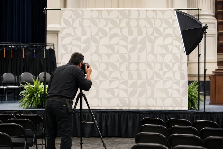
The final step is a full visual test. Place people in front of the display, add the intended furniture, switch on event lighting, and photograph the area from several likely positions. This simple mock-up can reveal problems that drawings and digital proofs may miss.
On-site testing is widely used in professional lighting and interior projects. Case studies published by the Illuminating Engineering Society describe mock-ups and on-site adjustments as important tools for coordinating lighting with complex architectural environments.
Camera-Ready Backdrop Checklist
- Measure the available width, height, and usable floor area.
- Photograph surrounding architectural finishes before designing.
- Choose backdrop colors that coordinate with the venue palette.
- Keep repeating logos readable without overcrowding the composition.
- Evaluate materials for glare, texture, wrinkles, and reflections.
- Coordinate nearby furniture and decorative elements with the backdrop.
- Test printed colors under the venue’s actual lighting.
- Check camera framing with individuals and groups.
- Inspect mirrors, glass, polished floors, and metal for unwanted reflections.
- Complete a final photo test before guests enter the space.
Creating a Backdrop That Belongs in the Room
The strongest fashion-event photo areas feel connected to their surroundings. Rather than covering a thoughtfully designed venue with an oversized graphic, planners can use color, scale, material, lighting, and furniture to establish a clear relationship between branding and interior design.
Early coordination also reduces the need for compromises during installation. When designers, production teams, photographers, and venue staff consider the complete environment together, the backdrop can remain recognizable in photographs while allowing the architecture and fashion presentation to retain their own visual presence.